Provide Context for the Data
Published: Wednesday, January 13, 2016

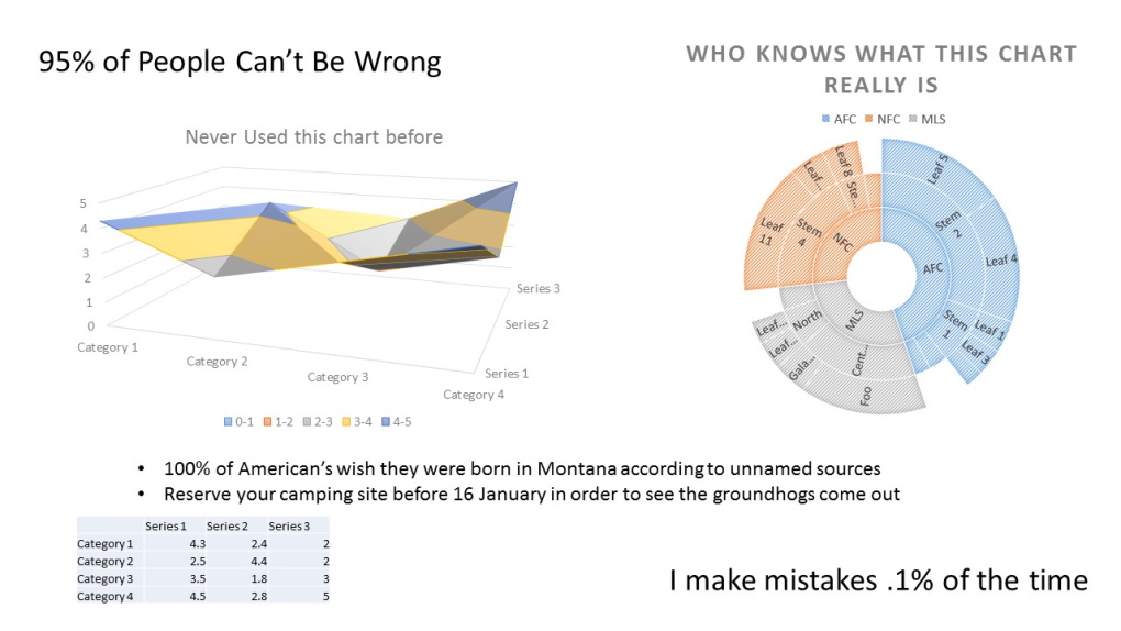
Just a bunch of information that makes no sense. Just like many decks I see with charts.
I am often asked to provide charts of data, tables of information, and bullet point lists though the week. I just put together a basic bar chart in Excel (Select your table and hit the F11 key) a few hours ago. Today’s topic in communication is making sure that the data meets the context of how it is being used.
Let’s face it, most people can manipulate facts to serve whatever message they are trying to get across. I am not suggesting that this is either good or bad. You may have heard the saying “Let the facts speak for themselves”. I would like to change this up a bit
‘Facts must have a narrator to tell the proper story’
Tips in communicating facts correctly
- Displaying the Top X should always have a total associated with it. We see the top 10 lists all the time, however, most of us never even question “Top X of what?” Is it the top 5 of 100? Or the top 5 of 6? By displaying the total helps users to have a better framing for what they are reading.
- With percentages and surveys show the sample size. Whenever I see a percentage in a slide my first thought is to figure out what is it based on. Is it .5% of 1,000,000 or 95% of 1,000? Which is affecting more people? This is really a big deal for me when I see numbers that affect customers.
- Make your bullet points stand on their own. Ensure if you are using bullets to present information to be concise, but have enough information to either:
- Take an action: Deliver one .pdf and one .pptx by January 31st
- State a fact: 5 Bugs were logged in the last 7 days
- Table information should include source data references. Many times we deliver a subset of data for reports, business reviews, or as a way to compare items. It is important to show where the sources of the data come from. Many times if I am using the data in a slide deck, I like to provide the details in the notes section so I can refer to it when needed.